
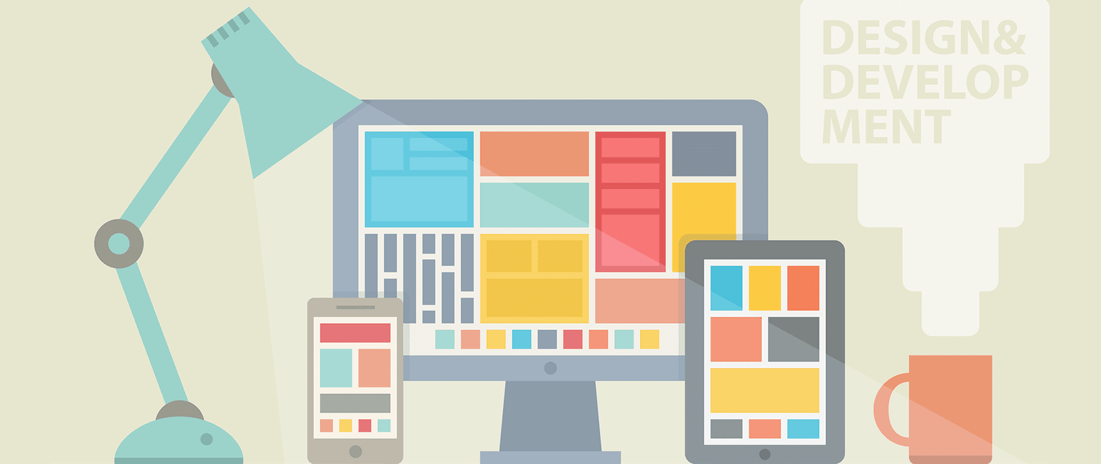

What is your look and feel?
The look and feel of your website is what results from all the decisions you make about its content and design.
It is a combination of:
The images you use. Both the style of your content images and photography, and the choice and arrangement of any decorative images.
- The attitude suggested by your text, and the language it uses.
- The color scheme you have chosen.
- The fonts you use to convey your information and draw attention to important elements.
- The way you arrange elements on the page to accentuate what is important.
You need all these elements to work in harmony. If you were promoting an industrial rock band and had lots of metallic textured images, it would look strange to have a fancy handwritten font, or lots of bright kid-friendly colors. Sometimes you can subvert conventional wisdom, but it’s usually better to play it safe.
Using design elements consistently sends a siŒnal to your visitors that you’ve paid attention to the details. It’s easy to put things onto a screen. It takes more care to combine them so that they look like they belong together in a single design. Work within a palette of four or five colors (plus shades or tints, as appropriate). Make the spacing between different elements on your web page consistent. Choose one or two fonts and use them throughout.
The rule of thumb is: if things look similar, they should be exactly the same. If they’re nearly the same, it just looks sloppy. If you don’t want things to look the same, then make them radically different. Leave no doubt that you have deviated from the norm to add contrast or emphasis, or to call attention to something.
When you’re developing the elements of your look and feel, keep your intended audience in mind. Think about the kinds of magazines they read, the TV shows they might watch, the films they prefer, and their favorite websites (until yours is built, at least). Use a visual language that will make them feel at home.
The right look and feel
To understand the importance of the look and feel, here are three websites that cater for different audiences.
The website for Seventeen www.scvcntccn.com a magazine for teenage girls, uses a pink, blue and green color scherne on white. To bring readers into the features, it has text-based navigation that is easy to skim read.
Saga www.saga.co.uk offers services including insurance and holidays to the over 50s. The homepage is clear and easy to navigate. It has a conservative blue and white color scheme. To help those with poor vision, it has an option to enlarge the text.
The Moshi Monsters website www.moshimonsters.com is designed for children. It uses text sparingly and keeps the language simple. There are few navigation options, which are shown using memorable icons. The color palette is bold and exciting, and is used to animate characters in the town scene.