
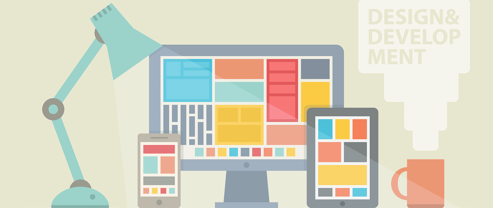
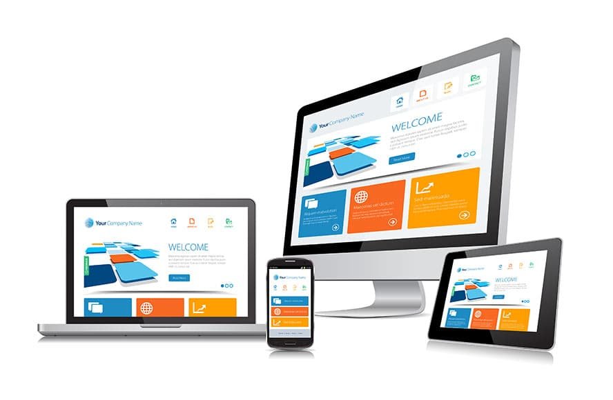
How devices affect design
Different devices have different capabilities, and this should inform the decisions you make while designing your website. For example:
- There might be no support for pictures (or “graphics”) on the device. A screenreader and Braille display can’t show images, and mobile devices sometimes enable users to switch them off to speed up their browsing.
- There might be no conventional keyboard. It puts everyone off if they have to type in lots of information to use a website, but those who have to use a virtual keyboard on their touchscreen might be especially deterred.
- The website animation technology Flash might not be supported. The iPhone and iPad don’t use Flash, and nonvisual devices (such as screenreaders) can’t render it either.
- There might be no mouse. Some users struggle to use a mouse because of physical impairment, and some devices (including games consoles and netbooks) don’t have a mouse. If you demand precise use of a mouse, you might lose visitors.
- There is a wide range of screen sizes. Even on a desktop computer, people will have different sized monitors and will open the browser window to different widths, depending on what else they’re doing at the same time as web browsing. Designers tend to have large monitors, but they shouldn’t forget that most of their audience have to settle for smaller screens.
- Devices differ in how much of the web page can be seen at once. Mobile devices might provide a small picture of the whole web page with little detail, so users can identify the content to zoom in on. Clear headings are important to help users navigate to the section they should read. Users with poor vision sometimes use screen magnifiers to massively enlarge a small part of the screen. If people are zoomed in on one part of the page, they can’t see any updates you make to a different part of it.
- A screenreader user can’t get a quick overview of what’s on the page by skim-reading it: while a PC screen is twodimensional, a screenreader has a one dimensional interface: a stream of audio reading the web page aloud.
The web browser challenge
As well as the differences in hardware used to visit websites, people often have a choice over which software they use. On a desktop computer, they might be using Microsoft’s Internet Explorer or Apple’s Safari browser. They might have downloaded Google’s Chrome browser or the Firefox browser.
They might even use more than one browser, depending on whether they’re at work or at home.
That’s another reason website design is a challenge: Web designers have to build sites that work with a wide range of different browsers, and each browser has its own quirks.
It doesn’t end there, though. These browsers are updated regularly, but not everybody upgrades at the same time. Internet Explorer version 8 (IE8) was released in 2009, but it is the last version to work on Windows XP, so it’s likely to have a significant market share for some time yet.
Despite high profile campaigns in the web community to persuade people to switch to something more secure and more fully featured, many people are still using IE6, which was released way back in 2001. If you’re a web designer, you can choose to ignore it, but are you willing to turn away those customers? It’s better to create a site that works for everyone, and let your visitors decide how they want to experience it.