
Laying out your navigation
You might think that every website looks different, but if you look closely, you’ll see that there’s often a lot of overlap in where navigation options are placed on websites. You can use this to your advantage: by borrowing from this consensus, you can make it easier for your visitors to understand how to use your website.
For example:
- Your site logo could be located in the top left corner and could link to the homepage.
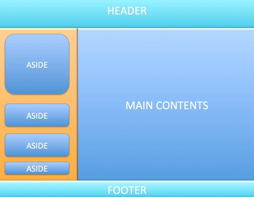
- Your site wide navigation options could be below the logo, or to the side of it. These will be the main links to different sections on your site, such as different types of products. In most sites, these links remain the same across every page of the site. In extremely large sites, these can change depending on the page the visitor is viewing, but they remain the most important links. This navbar should be immediately obvious. Its location helps communicate its role, but you can help it stand out by using larger text, contrasting color or spacing around it.
- Utility links might be placed in the top right corner. These are tools for using the site, so are separated from the content sections or product categories in the sitewide navbar. Utility links might include My Account, Log In, Help, Customer Service, Contact Us, Privacy Policy, and Search.
- The left sidebar might be used for navigation options that are relevant to the section the visitor is in. For example, if they are in the book section, they might see different genres here.
- The right sidebar might be used for bonus navigation options, such as tag clouds or links to the latest blog comments from visitors.
- The box across the bottom might be used for links to background information about the website (such as About Us, Press Releases, Investor Investor Information), and/or to provide a short sitemap with links into the main sections on the site and their most important subsections.
No site exactly matches this pattern, of course. It’s a generalization. Many websites will only have one sidebar, either the left or the right one, and some will have none at all. The sidebars often include other content, too, such as advertisements.
Some websites don’t have a horizontal navigation bar across the top, and put all their navigation options down the side. But it’s a useful crib sheet to help you design your navigation, because it will feel intuitive to visitors.
The pattern also ensures that the most important links have due prominence. All the important navigation options should be immediately obvious when the page loads.
A sitemap at the bottom of the page gives readers somewhere to go when they’ve finished reading an article, and the main navigation has been scrolled off the top of the screen.
Which links belong where depends on your site, but there are a couple of guidelines:
- The shopping basket is often placed in the top right corner, with the utilities, or on the right of the sitewide navbar.
- A link to the homepage (where present) should be the first item in any navbar.
- The search box can be placed almost anywhere, as long as it’s obvious what it is. It’s often seen in the top right, in the sitewide navbar, or at the top of the left or right sidebars