The diversity of devices
One of the skills a web designer needs is the ability to put themselves into the shoes of the website visitor. Web designers have to think about what their visitors know, what they will expect the website to do, and how they will expect it to work.
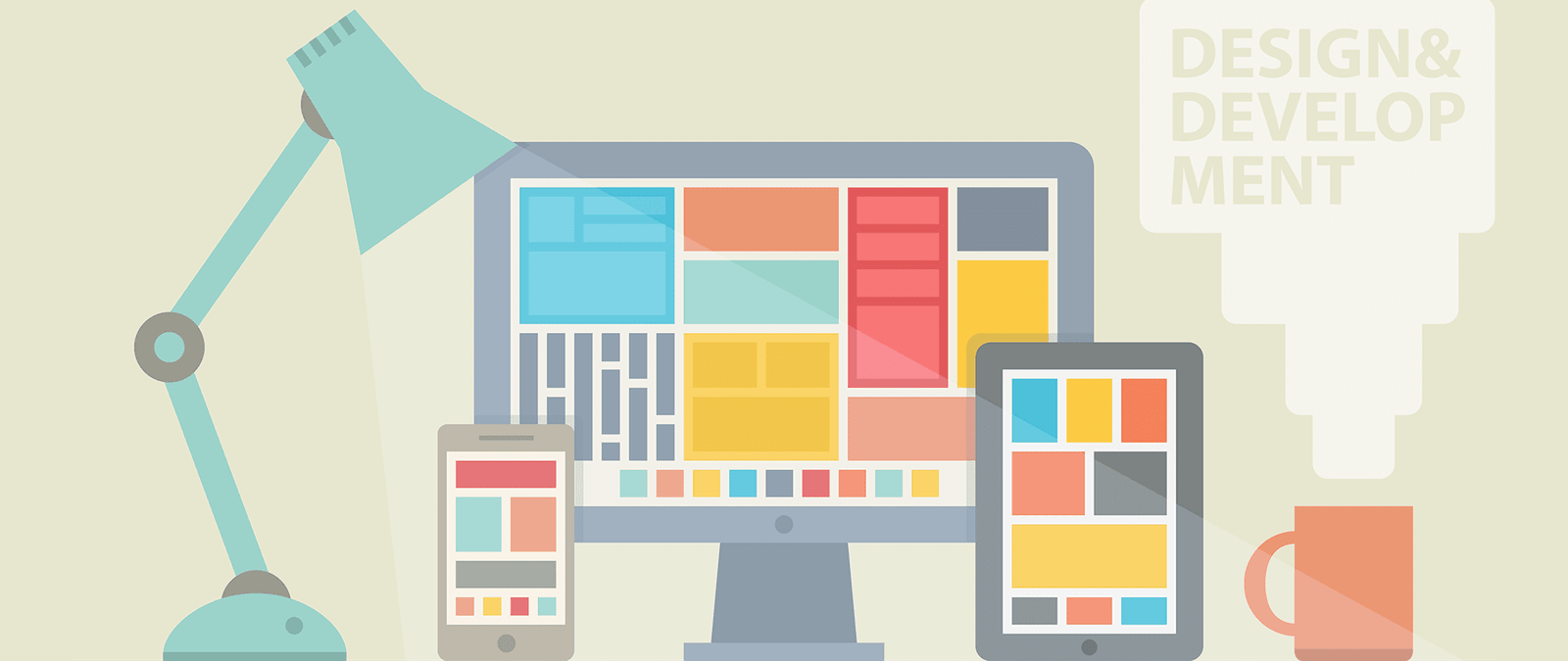
The most basic part of this is understanding the range of different devices that people might use to view your website. These include:
- A desktop computer, laptop or netbook
- An Android phone, iPhone or other handheld device
- A tablet device, such as an iPad
- An cell phone with a small screen and keypad
- A screenreader, which reads web pages aloud to blind people
- A refreshable Braille display, which a blind person can run their fingers along to read the website content
- A games console, such as the PlayStation, Nintendo Wii or Nintendo 3DS
When we use the word “design”, we tend to think of something visual. But, in its purest sense, a website isn’t necessarily a visual medium. Somebody using a screenreader might experience it as a stream of spoken text. Some handheld devices with small screens include a mode to switch off the layout and just view the content, so that it fits better in the space available.
While you do need your website to look appealing, it’s a mistake to think that you can (or should) focus purely on the look of a website. Some of the most important work in web design goes on behind the scenes, where the visitors can’t see it. It’s about adding meaning to the web page, so that people can use it easily even if their device doesn’t support all the features available on a desktop computer.
The challenge of web design is to create a site that is engaging and easy to use, whatever is used to view it. Visitors want the flexibility to use whichever device they prefer. Sometimes they will combine devices, using a desktop during their lunch break at work and a mobile on the way home, for example. All they care about is whether the site works or not. It’s your job to make sure it does.


