

Website accessibility
Degrading gracefully
You might be thinking that the solution is to create a different website for all the different user groups you have. You’re not the first to think of this.
Some years ago, it was fashionable for organizations to create a separate, text-only version of their website for the benefit of screenreader users. These users have requirements that are extremely different to the typical PC user, so many companies thought it would be easier to make a separate site for them than to reconcile their needs with those of mainstream website visitors.
Having a separate screenreader site created two major problems. The first was that this site inevitably ended up getting neglected. When resources were scarce, website managers would prioritize updating the main site. The text-only version would be put to one side and, ultimately, be forgotten. A screenreader user might visit the site for the latest news and find that it wasn’t available to them, although it was available to others using the main website. The organization’s attempt to look after blind visitors by specifically catering for their needs ultimately resulted in them being discriminated against.
The second problem was more subtle. Some screenreader users felt they were missing out because the organization had stripped out all the visual content. The fact that they couldn’t see the content didn’t mean that they weren’t interested in what was in it, or what its message was. Pictures often provide context or supporting information for text or visitor comments.
One site for all
Today, it’s not necessary to create a separate website for specific audiences. There are too many different devices and configurations for you to cater for them all anyway. Instead, you should aim to create a single website design that degrades gracefully. That means that it can still be used if particular features aren’t available on the visitor’s device or browser. For example, if somebody can’t see a photo, you should provide text that explains its content. If the web browser doesn’t support content created using Flash or Javascript, visitors should still be able to navigate the site and use the rest of its content.
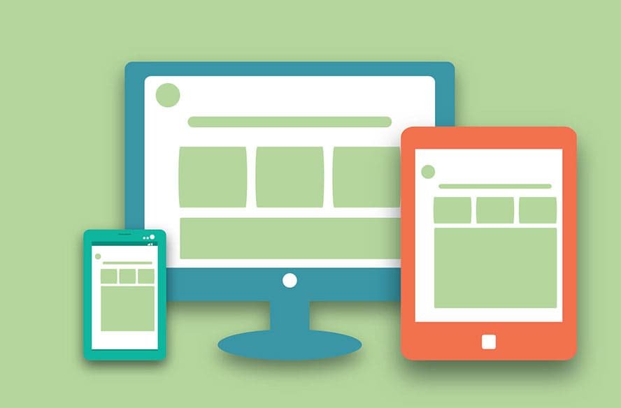
A well designed website will work on any device and web browser.
What about mobile?
There is one exception to the rule of “one site for all”, which you might have come across. Many companies today are creating separate mobile websites. The difference in size between the largest available PC screen and the smallest mobile screen is so vast, some companies argue that serving two separate websites is the best way to keep both audiences happy.
While websites should always be optimized for speed, users of mobile devices often have a slower web connection than those using a desktop PC, too, so they need a site that is optimized to download in small chunks, with excessive decorative images stripped out.
There are two times when it’s a good idea to create a separate site for users of mobile devices, assuming a significant chunk of your audience might want to use mobile devices:
- If you have a tiny website. You can probably maintain two different versions of a website easily if it’s only got five pages.
- If you have a vast website. If your site has hundreds of pages, you’ll probably need to use a content management system for it (see Chapter 13). This should make it possible to have your mobile site automatically generated from the same database of articles as your main website. That will ensure your mobile site always reflects the same content as the main site, and will update at the same time.
Understanding accessibility
Accessibility is all about making sure your website can be used easily by everybody. When people talk about accessibility, they often think of blind people using screenreaders. But it’s not just about those who use completely different technologies to visit your website.
There are lots of people who have more subtle needs that you can help or hinder through the way you design your website. A lot of these people wouldn’t consider themselves to have any special needs at all. They’d just find your website hard to use, and give up. For example:
- Can somebody who is color-blind understand the availability of tickets, or is it shown as purely different colored blobs?
- Can somebody who has impaired vision increase the font on your web page so it’s easier to read?
- If somebody can’t use the mouse, can they navigate your site using the keyboard?
- Can a visitor with impaired hearing get the same information that you’ve included in an audio file?
- Can somebody with a mental impairment understand your content, or is it too jargony and long-winded?
Most professional website designers today understand the importance of accessibility, but it’s the least visible aspect of a website design project, so it can be overlooked. Much of the important work is to do with how a website is coded, and when you visit it using a conventional desktop PC, you can’t easily tell whether it’s been well designed for other devices or not.
Accessible websites tend to be easier for everybody to use. They adapt well to mobile devices, and are easier for search engines to index, too. If you need to convince colleagues of the importance of accessibility, you could argue that you want to reach as many customers as possible, or could point out that your business might contravene disability discrimination laws if you don’t.
Most websites strive for accessibility because they want to be as inclusive as possible, though. It’s not hard to make most websiteS accessible, and it doesn’t cost any more, as long as you plan to make your site accessible from the start.
Top accessibility principles
I’ll share some tips for making your site accessible when we look at HTML and navigation later, but to provide some context, there are some basic principles that can go a long way towards making your site easy to use.
- Provide alternative text for anything that isn’t text, such as an image or video. This does not necessarily appear on screen. When you add an image to a web page, for example, you also provide alternative text that is only presented to the user if the image isn’t available.
- Make sure that your site still works when JavaScript, Flash or other interactive elements are switched off. When this is impossible, provide the same information in text form on an accessible web page.
- If users have to respond within a certain time limit, make sure that they are warned and have enough time to request more time, if they need it. Give users controls to start and stop content that moves or updates itself.
- Use clear and consistent navigation. Make sure that users can easily understand where each link will take them, and give each page a title that describes its purpose.
- Don’t open pop-up windows, or change the window the user is in, without warning. This is confusing if you can’t see the screen, and it stops the Back button working, the most important navigational tool on the Internet.
- Use the simplest language appropriate for your site’s subject matter. Complicated language is harder to understand, especially if you can’t easily flick your eyes back to the previous line for a refresher on what it said.
- Give users control over how they view your content. Make sure your site works, for example, if people enlarge the default text size in their browser.
- Make sure that any information conveyed by color can also be understood in other ways. For example, it’s okay to use different colors to draw attention to different icons, but you might also make them different shapes or put them in different columns to indicate their meaning.
- Make sure there is enough contrast in the foreground and background colors you choose for everything to be legible on a black and white screen.
- Avoid overcomplicated page layouts. If there are too many different sections or boxes it can be overwhelming for visitors to try to navigate.
- Use HTML and CSS correctly. Test whether the code has any errors in it. Desktop browsers can be quite forgiving, but assistive technology might struggle to understand your web page if it includes technical errors.
- Use the accessibility features available in HTML to help people navigate tables and forms. They enable you to provide a context that might otherwise be communicated by the position of things on the screen.
- Don’t use a picture of text unless it’s essential. It’s a good way to show a company logo, for example. But don’t create an image for a paragraph of text just because you like a particular font.